For designers
Chameleon is used as a tool for Mediahuis digital products, creating consistency by linking UI elements to documentation (this site) and code. But how do you work with it, as a designer?
First, install Figma
Chameleon is using Figma as its tool of choice, where design work can be done collaboratively. To guarantee the best experience, you will need the Figma desktop app for Windows or MacOS.
In Figma, there is no requirement to install font-families locally as they can be directly accessed through the platform. However, if the intention is to use the brand fonts in other applications, they must be installed on the local device.
New to Figma? Check out some tutorials to get you started
Start designing
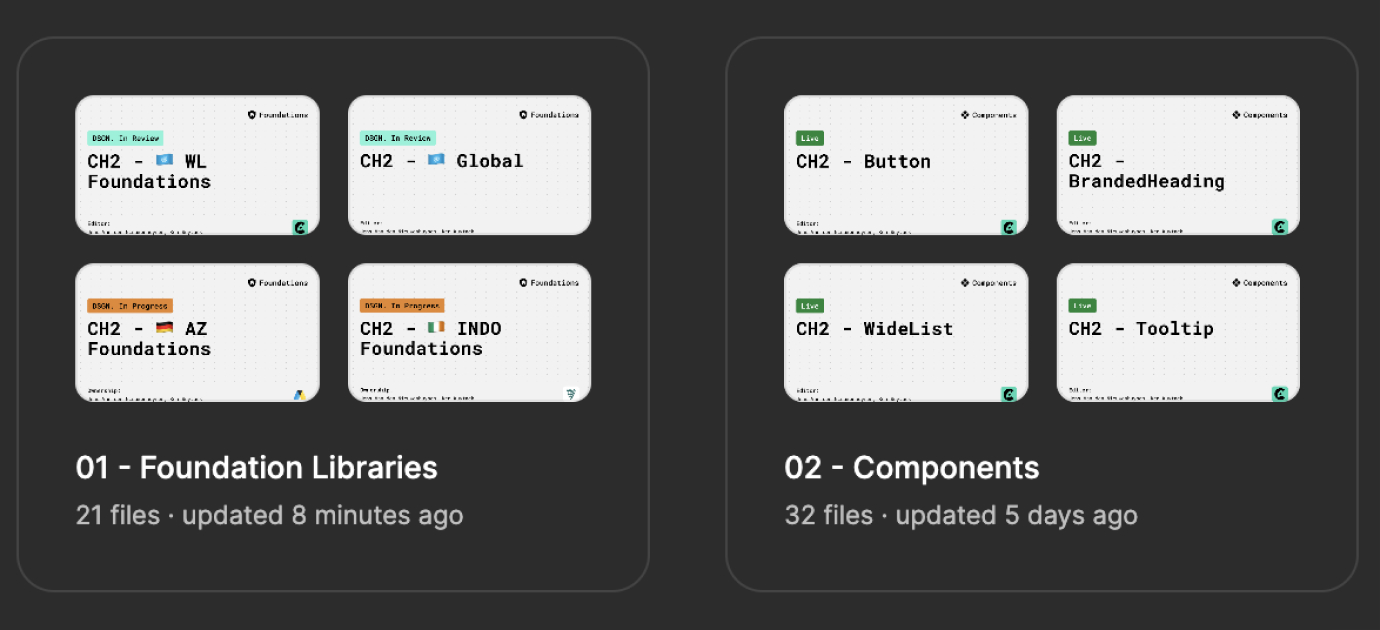
Libraries
There are a number of Figma libraries that make up the Chameleon design system:
- Foundation libraries per brand: containing foundation colors, fonts and assets like icons, logos and illustrations.
- A global foundation library containing some shared foundations like UI colors and a spacing scale.
- Components: Almost every component has its own library; some are grouped liked input fields.
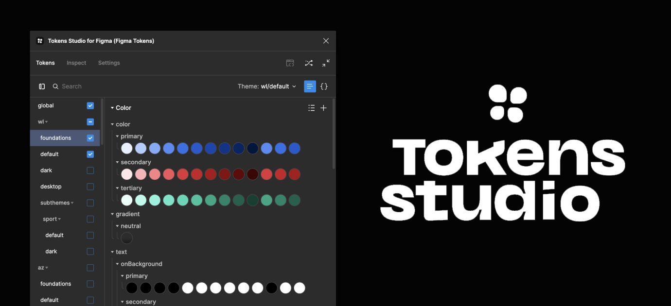
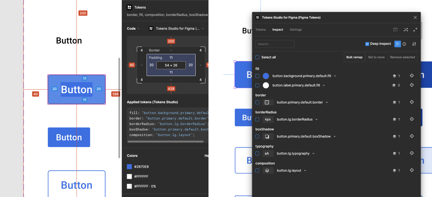
Tokens
For a better sync of the design tokens between Figma and our code, we’ve started to work with a Figma plugin: Tokens Studio. By designing directly with tokens, our UI designers will be more consistent in their design choices and the created designs will be easier to maintain. Since Chameleon is a multi-branded design system, it’s also very handy to switch a design to another brand/theme via the Tokens Studio theme switcher.
Learn more about Tokens Studio? Check out their documentation
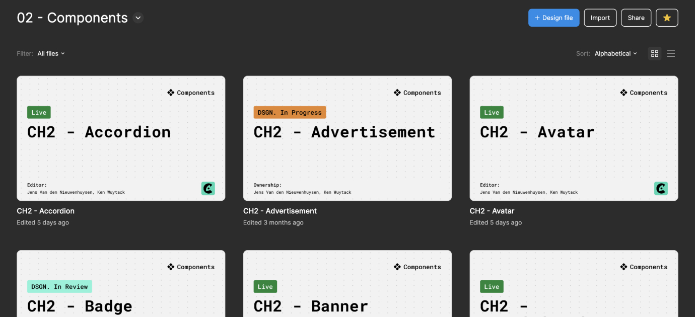
Components
As mentioned above, almost all of our components have a dedicated Figma library. Some we’ve grouped together because they use the same ‘atoms', like ControlInput (Checkbox, Choice, Radio and Switch) and TextInput (DataPicker, Select, TextField and Textarea).
The easiest way to find a specific component library in Figma is to type 'CH2 -', followed by the name of the component. All of these components are styled with our design tokens, so to view/use them in another theme, a designer can use the Tokens Studio theme switcher.
Missing pieces?
We know not everything can be built using just our components, so we’ve added some special alias tokens - we call them semantic tokens - to use when building your product with design tokens. They serve as a common language to understand Chameleon, aiding in linking significance, context, and purpose to the design tokens being utilized in your product.
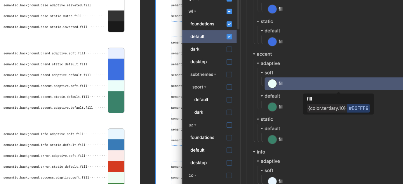
Next to this, you can also re-use component specific tokens if the element you’re designing, is very related to a component but not completely. For example: you want a LinkText element but in a smaller font-size? Re-use as much of the LinkText tokens to have design consistency, but use a semantic token for the font-size.
Developer handoff
We advise to use Figma DevMode, which is a new space in Figma for developers with features that help them translate designs into code, faster.
Tokens Studio is also available in DevMode - but the plugin can be used (in editor mode) to look up which tokens are used where via the (deep) inspect mode. In order to utilize the Token Studio plugin in DevMode, it’s essential to first save the plugin.
Connect with us
Please feel free to reach out to the team to get help, identify defects, request features, or contribute.