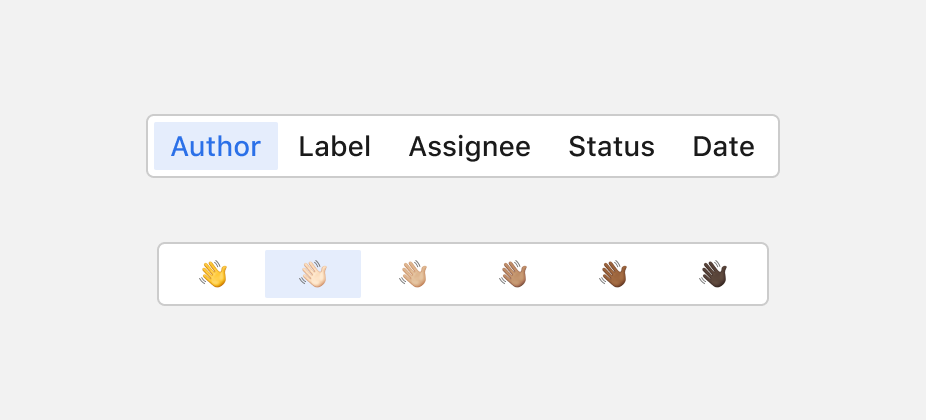
SegmentedControl
A Segmented Control lets users choose a single or multiple options from a series of related choices.
Usage
- Use a Segmented Control to toggle between views or related content. Avoid using it for navigating distinct content areas like subpages.
- Clicking or pressing an item should indicate an action that takes effect instantly.
Item content
1. Icon only
2. Label only
3. Combination icon & label
Size
Segmented Controls come in two sizes: sm and lg (default). Sizes changes primarily the lineheight, padding and font-size.
Full width
By default, Segmented Controls automatically adjust their size to fit the text content and padding, occupying only the necessary space for comfortable display. However, they can also be configured to stretch to full width, evenly distributing the segments across the available space for a more balanced layout.
Orientation
A horizontal layout is commonly used, though in some cases a vertical layout may be more effective.
Type
1. Single
The Segmented Control behaves like a traditional radio button group. Only one item can be selected at any time. This case is used when the user must make a mutually exclusive choice, so the active item can not be unselected.
2. Multiple
It enables the selection of more than one segment at a time. Each segment functions independently, meaning users can activate and deactivate several options without affecting the others.
Tooltip
When an icon only is shown, a built in tooltip will show the label on hover.
Do’s & Don’ts


