Radio
Radio buttons provide a user with a concise set of options to choose from, allowing them to make a single selection from the group.
Usage
- Use Radio buttons where users must make a single selection from a list of options.
- Radios should always be accompanied by a label.
- Use a Fieldset to group multiple Radios.
- Typically associated with a form that must be submitted for changes to be saved/reflected.
- Only use Radio to change settings, not as a trigger. Use a Button if you need to perform an action.
Anatomy

A. Input
The selection control.
B. Label
The text label associated with the Radio.
C. Optional label
Indicates if the input is optional. The optionalLabel also removes the required attribute from the input.
D. Action
Mostly a link that can refer more information on the subject.
E. Message
Give additional information to the user.
Required vs optional
Rather than using an asterisk (*) to indicate required form inputs, Chameleon treats all form elements as required by default and displays an optionalLabel for fields that are optional.
Do’s & Don’ts

 In a form, Radios should always be placed underneath each other for better scanability.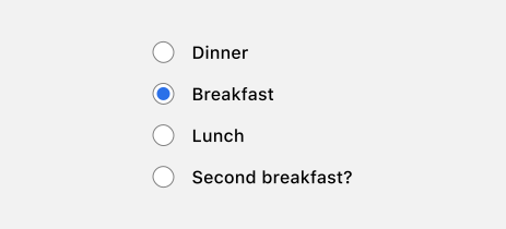
 Avoid listing Radios in a non-logical order.