Icon
Icons can be used to provide extra visual context for other items.
Usage
Chameleon icons should be used to communicate action, draw attention and convey more meaning. They should, when possible, always be paired with a text label.
Size

All icons are available in sets of four different sizes: small 16, medium 24px, large 28px, xlarge 32px. The default size is medium.
Do's & Dont's

 Pair the Tooltip component with an icon without a label.
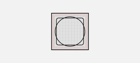 An icon should always be designed on a 24px grid with a padding of 2px.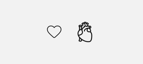
 Don't be overly literal and avoid complexity when designing icons.
 Your icon color need to pass a color contrast ratio of 3:1