Dialog
To draw attention of the user to a dedicated piece of content, you can use a Dialog.
Usage
- A Dialog displays content in front of an app or website without losing context of the page beneath it. Use a Dialog when you require a user's response or want to display critical information or a warning where a response is needed. They're intended to support short secondary tasks initiated by the user and should only be triggered by a user interaction.
- Always use them in a thoughtful and intentional way, because they interrupt a user's experience and can be perceived as annoying.
- Every Dialog can be dismissed in different ways. Either by clicking the "x" IconButton in the header, pressing the escape key or clicking the backdrop. If the user's abillity to dismiss a Dialog is disabled, the user must choose an action to proceed.
- On our web products, the Dialog screen becomes a full screen experience with no backdrop. For our native app products, design seperate interfaces following the modal view guidelines for iOS or the Dialog guidelines for Android.
Anatomy

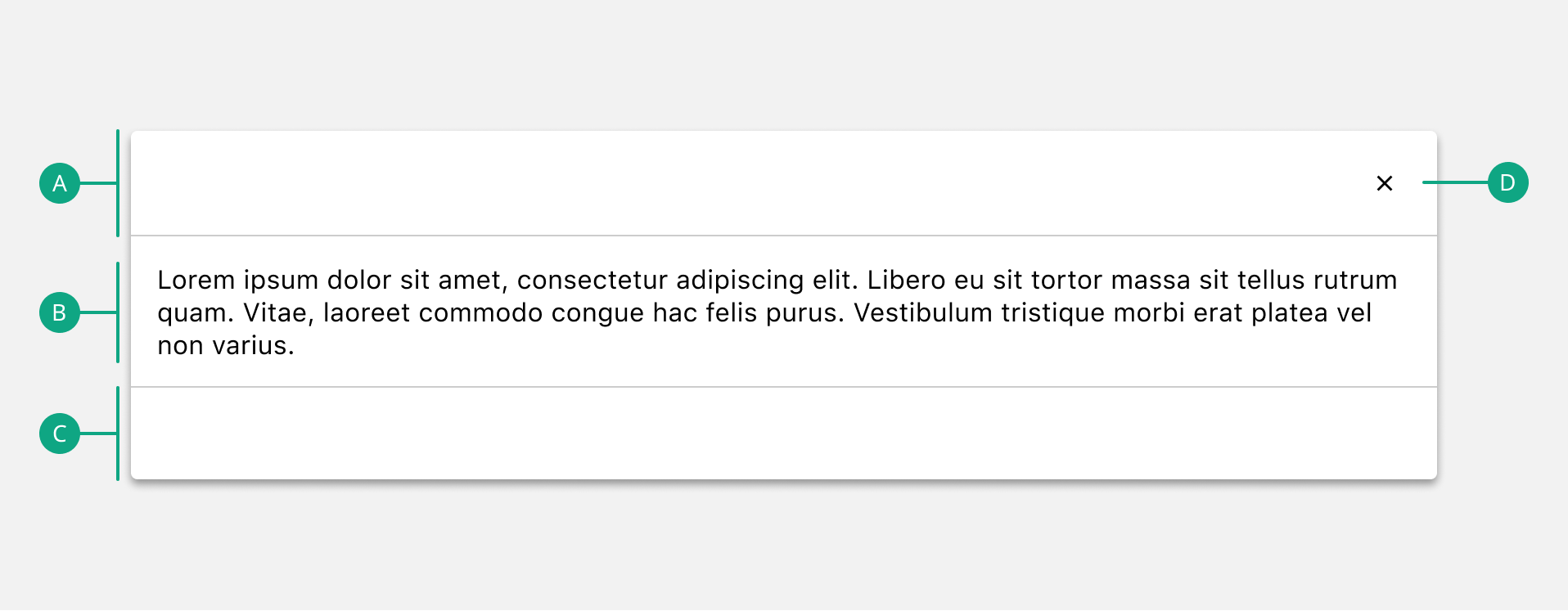
A. Header
The top of the Dialog. Can be hidden.
B. Content
The content to be conveyed to the user. Can contain any sort of content.
C. Footer
The bottom of the Dialog can be hidden or can contain other elements e.g. Buttons.
D. Close IconButton
Closes the Dialog.