Default Teaser
An article teaser refers to a summary of a longer written news article. Its purpose is to entice readers and generate interest in the full article by offering a glimpse of the content's main points, intriguing information, or engaging elements. This pattern is called Default Teaser because it’s the most common visual representation of an article teaser.
Appearance

A. Editorial animation
Animated element used to enhance and visualise editorial pieces.
B. Editorial label
A tag used to highlight specific themes or topics within editorial content like breaking or live.
C. Label
A short descriptive text indicating the category or topic of the article.
D. Sublabel
Additional information or subcategory related to the label.
E. Premium
An icon or logo representing a premium article.
F. Comments
A visualisation indicating whether comments are enabled for an article, with the option to display the total number of comments.
G. Prefix
Additional information or subcategory related to the label.
H. Introduction
A brief overview or summary of the article. Due to space constraints, this feature is not available on size “sm”.
I. DateTime
The date and or time the article has been published. Can also serve as the video duration.
J. Title
The headline or main title.
K. External icon
The external link icon indicates that it will take you to a webpage outside of the current website.
L. Image
A visual representation, such as a photograph or illustration.
Orientation
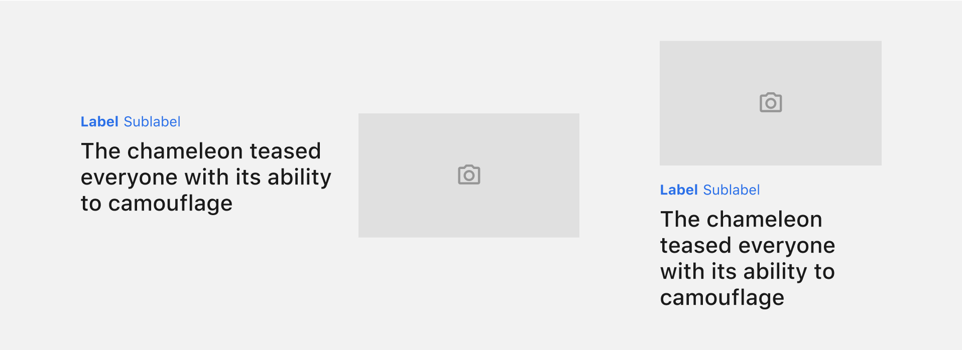
This allows you to define the orientation of the Teaser, choosing between “horizontal” to arrange the content side by side or “vertical” to stack the content.
Size
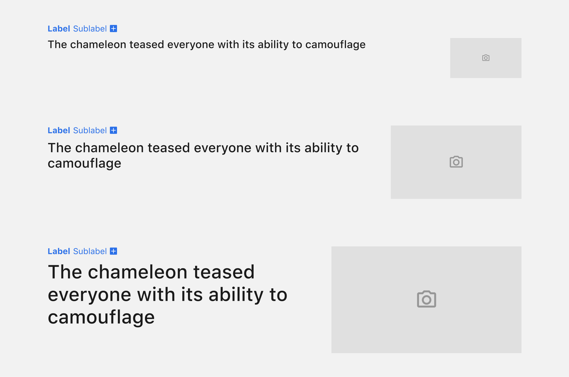
The available options are "sm" for small, "md" for medium, and "lg" for large. These options primarily impact the size of the title, but in the case of a horizontal orientation, they also influence the size of the image displayed in the Teaser.
Article type
This introduces visual markers to content previews, offering users more understanding of the article's format. This approach ensures a more efficient navigation through diverse content.
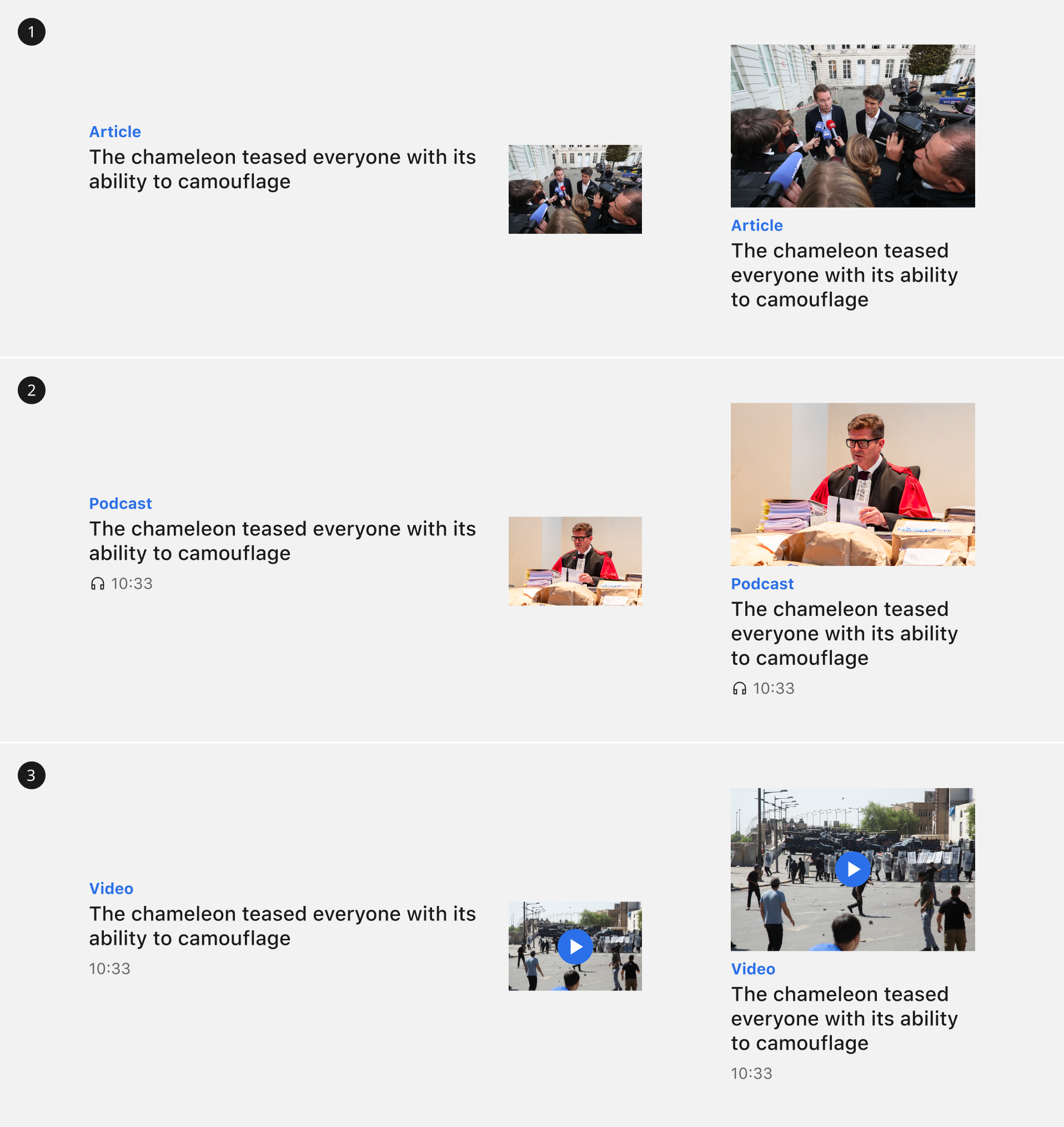
1. Article
The default article type of a Teaser. No extra visual cues will be added.
2. Podcast
Adds the Podcast icon to the duration.
3. Video
A play button is visible on the image.
Combining Highlight & Inset

Please note that these props can be combined to transform the Teaser into a highlighted version with the inset adapting to a background color distinct from that of the page or section. This intentional separation of colors prevents the content from appearing stuck to the sides, thereby ensuring a visually appealing contrast. However, it’s important to emphasise that combining these props is an option, not a requirement. The Teaser will still function effectively without this combination, maintaining its intended purpose and design.
Configuration: position of the premium logo.
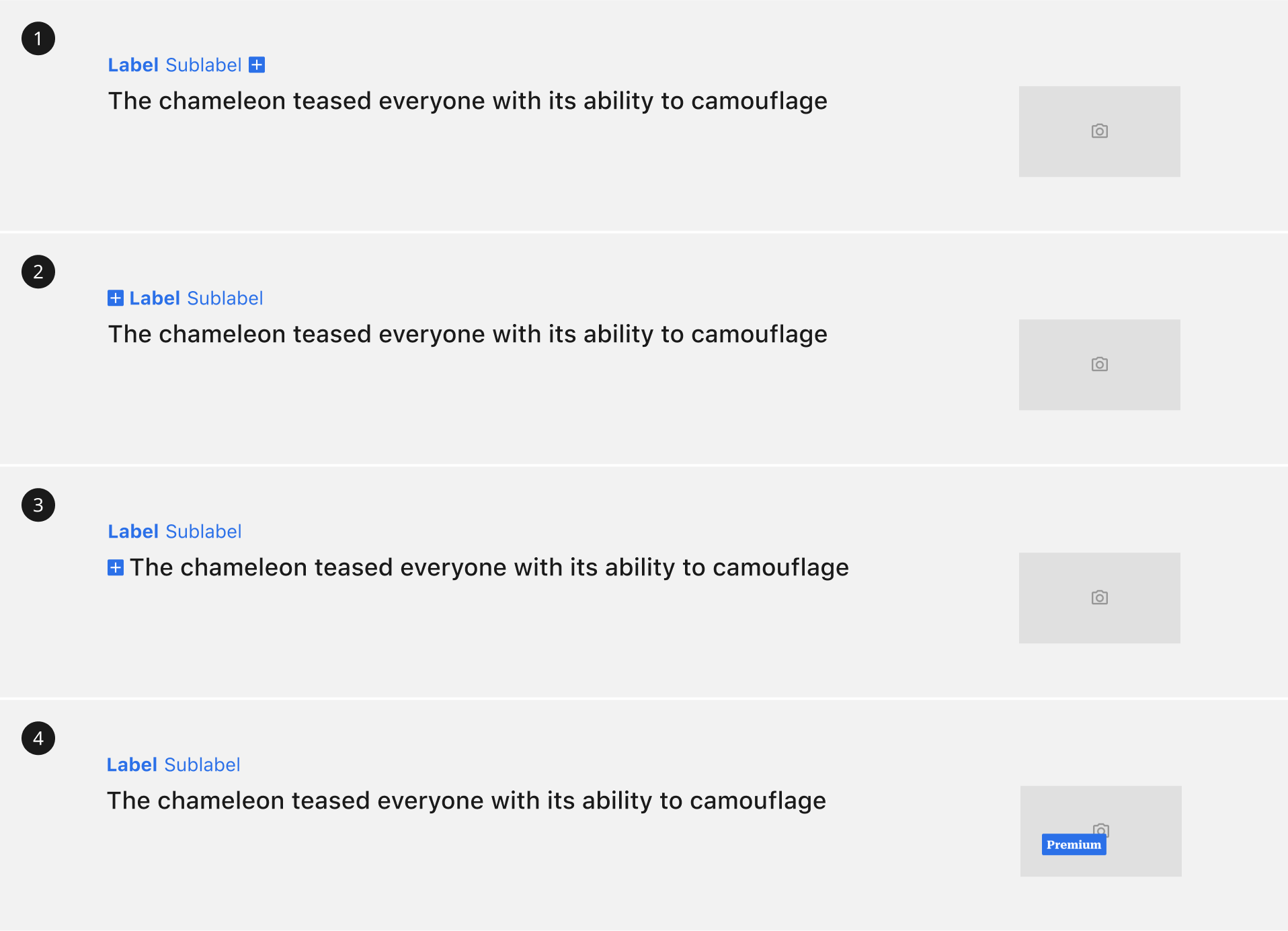
1. After taxonomy
2. Before taxonomy
3. Inline with title
4. On top of the image
This configuration introduces a unique variation wherein the premium logo is elongated and positioned atop the Teaser's image, creating a distinctive visual style that effectively emphasises premium content. If no long premium logo is specified, the main premium logo will be displayed by default in the position of the long premium.
Configuration: image ratio
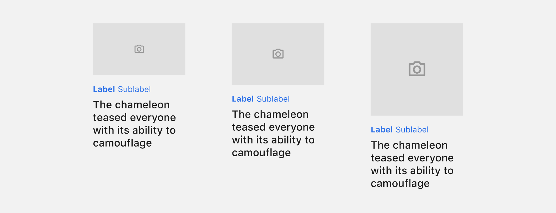
The flexibility of the Placeholder component allows for effortless alteration of the aspect ratio, accommodating a wide range of fixed ratios such as 21:9, 16:9, 3:2, 4:3, 1:1, and 4:5, while also providing the freedom to work with custom ratios if needed.
Configuration: horizontal image position
The DefaultTeaser supports positioning the image on either the left or right side. This positioning is configured at the brand level.
In small DefaultTeasers, the taxonomy is positioned above the image, when right aligned, to optimise the limited available space.
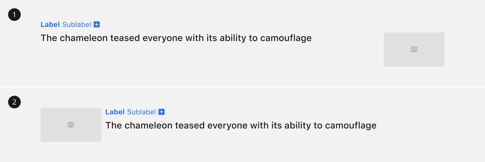
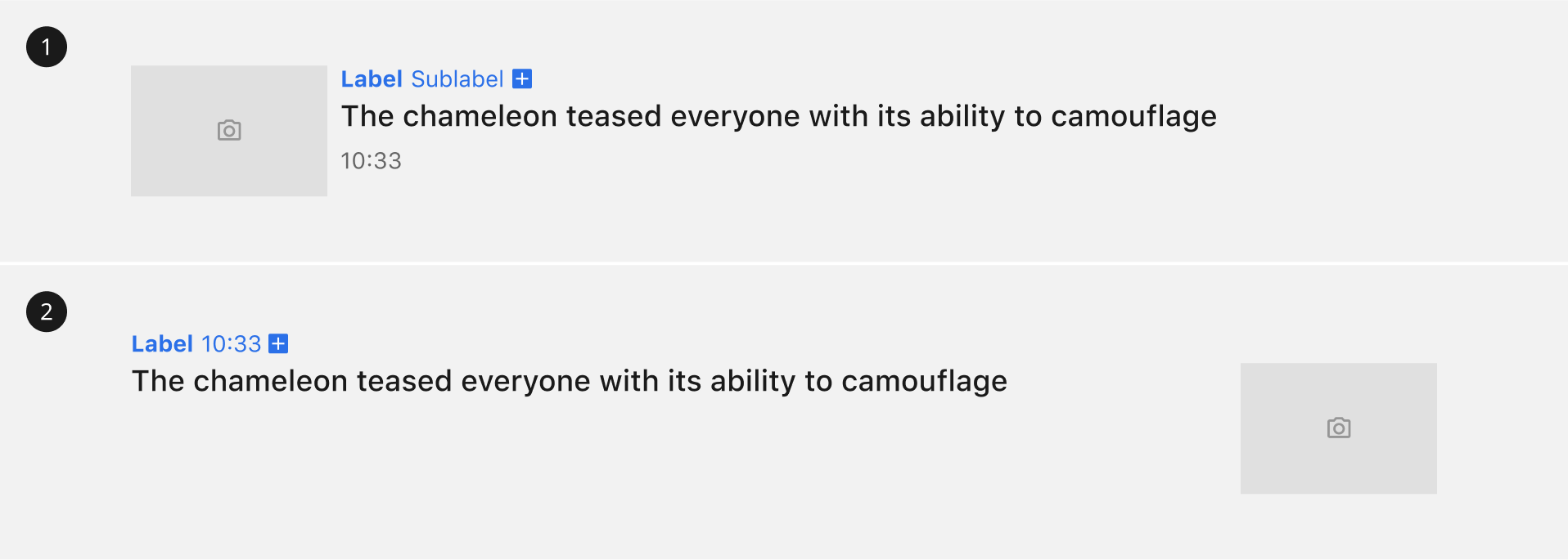
1. Image right
2. Image left
Configuration: DateTime position
The DateTime configuration is set to appear at the bottom of the teaser content by default. Alternatively, it can be positioned within the taxonomy section, which follows the styling of the sublabel.
