DatePicker
Allows users to enter a date. This can be done by either having the fill out the date via an input, but also provides the user with a calendar view for easier date selection.
Usage
- Use a DatePicker when a user has to select a single date or date range from a grid style calendar or by typing in a date corresponding to the placeholder.
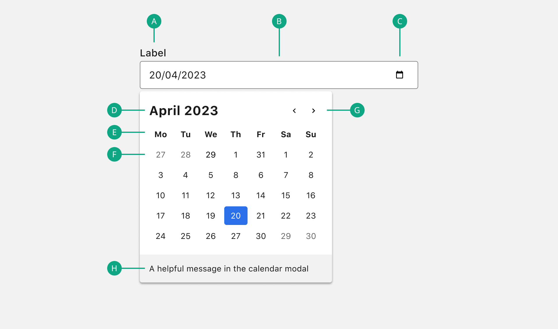
- Clicking the calendar icon triggers the calendar dialog. Within the dialog, the current date is indicated by an active colored state. Switching between months can be done by toggling the previous or next arrow. The calendar dialog is closed after a single date is selected.
- Selecting a single date can also be done by typing in the date as indicated by the placeholder text.
Anatomy

A. Label
The text label associated with the DatePicker. An optionalLabel can be used to indicate that the field is optional and also removes the required attribute from the input.
B. Input
The text input field where the user can manually type in the date.
C. Icon
The also clickable icon indicates that the calendar modal is available.
D. Month and year
Specifies the month and year view of the calendar modal.
E. Week day
Days of the week.
F. Day
Days in the month.
G. Previous and next month controls
Allows the user to move forward or backward one month at a time.
H. Picker footer
Give additional information in the calendar modal.
Required vs optional
Rather than using an asterisk (*) to indicate required form inputs, Chameleon treats all form elements as required by default and displays an optionalLabel for fields that are optional.
Do’s & Don’ts
