Choice
A visual alternative to Radio buttons and Checkboxes. They allow a selection of single or multiple options from a set of predefined options.
Usage
- The Choice component can be used when a user has to choose from a list of grouped options. They are a visual alternative to Radio's and Checkboxes and allow a selection of single or multiple options. Besides being a visual alternative, Choices are primarily used to create a list of related options that can be expanded. When selected, they can contain extra content or actions.
- When a user has to pick a single option, use the Radio type Choice. When a user can choose from a set of multiple options, use the Checkbox type Choice.
- Besides being a visual alternative for Radios and Checkboxes, Choices are primarily used to create a list of related options that can be expanded. When selected, they can contain Children: extra content or actions.
Anatomy
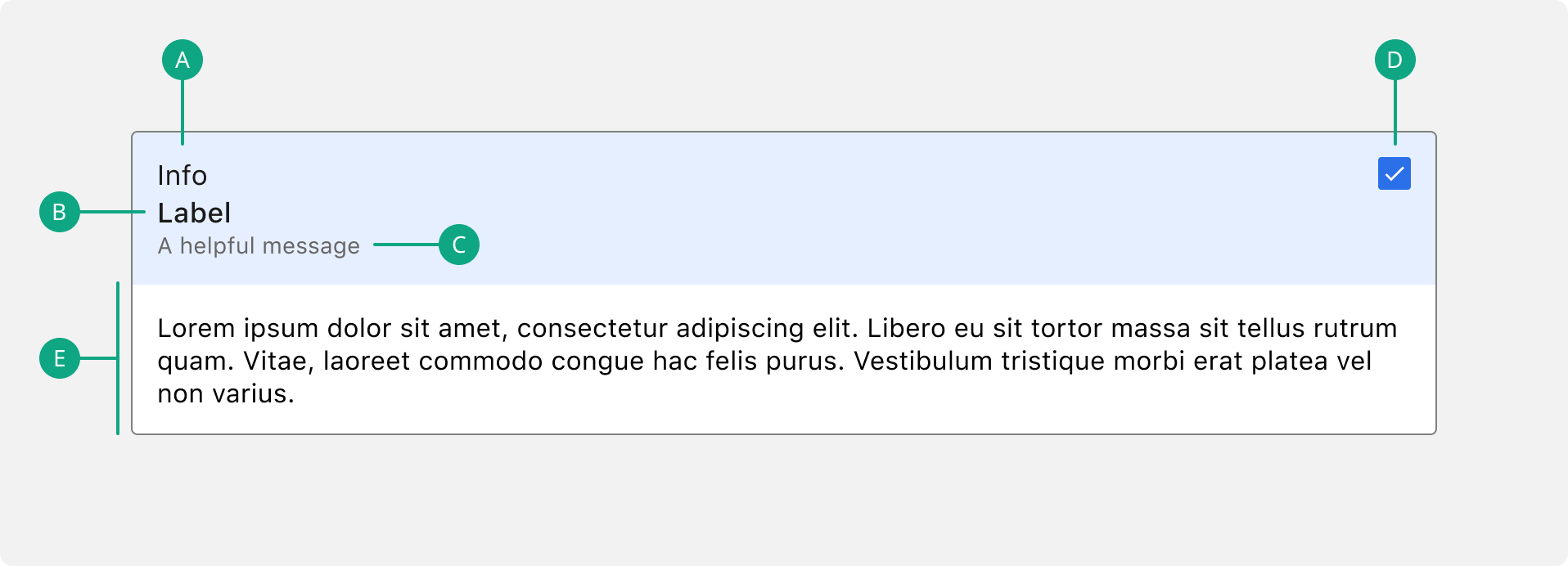
A. Info
Provides extra context to the Choice.
B. Title
The text label associated with the Choice.
C. Caption
Give additional information to the user.
D. Input
The visual representation of the selection control. Can be a Radio, Checkbox or a Switch.
E. Children
The content only shown when a specific Choice is selected.
Image

Visually provide extra information to the Choice by passing an image. Please, don’t forget to add an alt tag.
Do’s & Don’ts
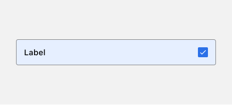
 The Choice component should take up 100% available width of its parent container.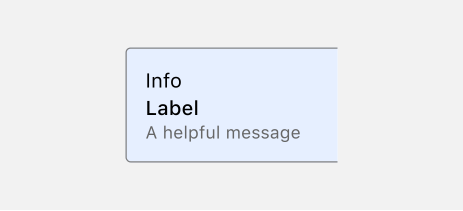
 Info and caption are optionable, the title is always required.