Checkbox
A Checkbox is an input control for making selections.
Usage
- Checkboxes allow the user to select any number of choices, including zero items, one item or multiple items.
- Checkboxes should always be accompanied by a label.
- Use a Fieldset to group multiple Checkboxes.
- Use a stand-alone Checkbox for a single option that the user can turn on or off.
Anatomy

A. Input
The selection control.
B. Label
The text label associated with the Checkbox.
C. Optional label
Indicates if the input is optional. The optionalLabel also removes the required attribute from the input.
D. Action
Mostly a link that can refer more information on the subject.
E. Message
Give additional information to the user.
Required vs optional
Rather than using an asterisk (*) to indicate required form inputs, Chameleon treats all form elements as required by default and displays an optionalLabel for fields that are optional.
Do’s & Don’ts
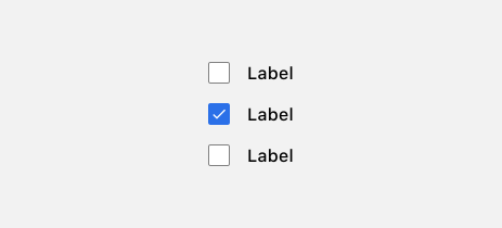
 In a form, Checkboxes should always be placed underneath each other for better scanability.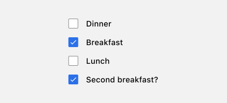
 Avoid listing Checkboxes in a non-logical order.