Accordion
The Accordion component is a list of items, allowing each item’s content to be expanded and collapsed by clicking its header.
Usage
- Accordions are composed of a list of items, with a header button that can be clicked to toggle the visibility of extra content. They should be used to help users navigate and digest large blocks of information.
- Each item’s header is focusable and it’s content visibility controlable by pressing Enter or Space.
Anatomy
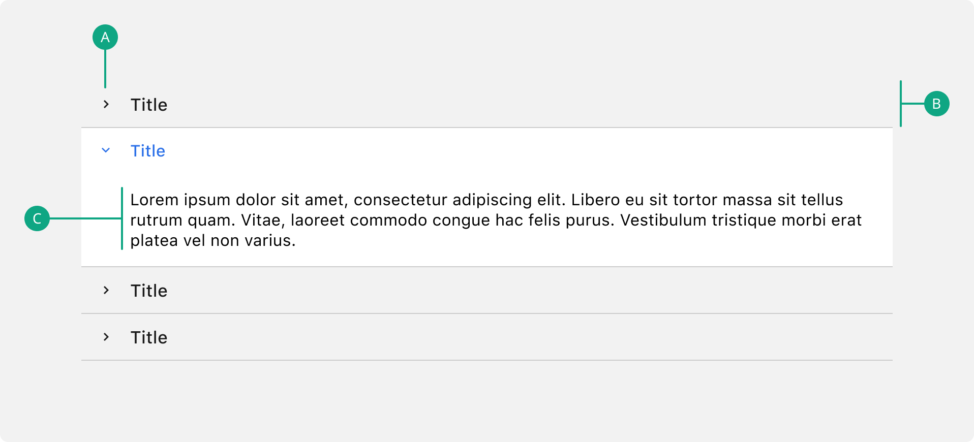
A. Icon
Indicates if the body is open or closed.
B. Header
Contains the section title and controls the expand and collapse behaviour.
C. Body
The content associated with its header.
Do’s & Don’ts
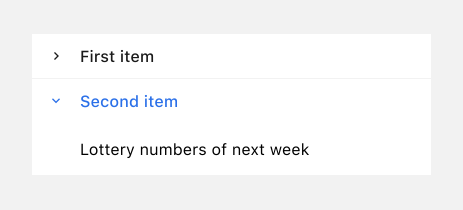
 Do not hide important information in the expandable area.