For designers
Learn to use the building blocks to make well designed Mediahuis projects.For developers
Link the repository and start using Chameleon in your Mediahuis project.For webmasters
Make sure your creations fit the brand guidelines and maintain consistency.For business
What are the benefits? How can your brand also onboard onto Chameleon?
Chameleon Design System

Set the foundations. Apply your brand's specific styles like fonts, colors, shades, border-styles, illustrations, icons, ...

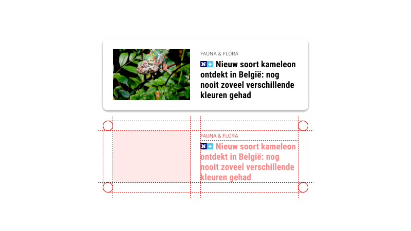
Components are the reusable building blocks of our design system. Each component meets a specific interaction or UI need, and has been specifically created to work together.

A pattern is a combination of components, that solves common user problems. These best practice solutions enhance the user experience by ensuring consistency.

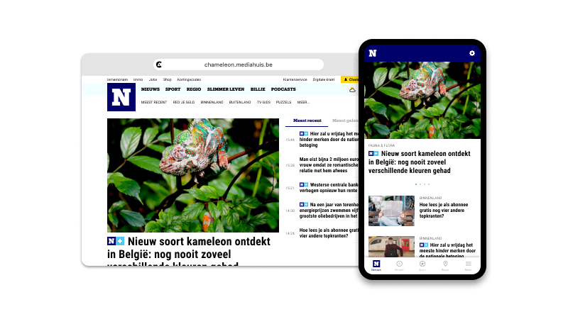
The end result is a set of reusable elements and guidelines that can be used to consistently design and develop digital products, such as websites and apps. The goal is to create a cohesive branded visual and user experience across all products, while also streamlining the design and development process.
Mediahuis brands using Chameleon
Want to contribute?
A design system lives and dies by its usage by both developers and designers. For this reason, we more than welcome your involvement.
See how you can contributeNeed support?
We use our internal Slack as the main communication-channel but you can also send an email.
Join #chameleon-general


